High-performing pins are built on repeatable design decisions: a clear promise, instant readability, consistent branding, and a layout that guides the eye to click. A checklist-based approach makes it easier to design pins fast while staying consistent across every new post, product, or campaign—especially when you’re creating multiple variations at once. For more guidance, see [PDF] table of contents.
A pin earns clicks when it communicates one strong idea quickly and looks trustworthy at a glance. Focus on these core traits: For further reading, see Resources – Craft Industry Alliance.
For official platform guidance on formats and best practices, use the Pinterest Business Help Center as your baseline.
The fastest way to improve pin output (without sacrificing quality) is to stop reinventing layouts and start swapping content into a proven structure.
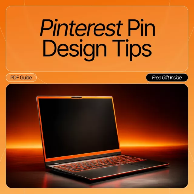
If you want a repeatable system you can duplicate each week, the Pinterest Pin Desig Tips Checklist – Editable Digital Download for Bloggers, Creators, and Small Business Owners | Pinterest Pin Design Tips for High-Converting Pins is designed for quick reviews before you export and publish.
Small design choices add up fast on a scroll-heavy platform. These “quick wins” help pins feel clearer and more clickable.
For a deeper refresher on hierarchy and layout decisions, practical primers from Nielsen Norman Group and the Canva Design School can help you spot what’s competing for attention in a design.
Run a quick review before exporting so every pin meets the same quality bar—especially when batch-creating multiple variations. This also works well as a team handoff: anyone can verify pins are on-brand, readable, and aligned to the landing page.
A simple habit that improves results over time: create two variations per URL (a different headline angle and a different layout, like image-first vs. split) while keeping your branding consistent.
| Area | Checklist items | Pass criteria |
|---|---|---|
| Message | One clear promise; headline matches landing page; no conflicting claims | A viewer understands the topic in 2 seconds |
| Readability | Large type; strong contrast; minimal text; safe margins | Headline readable on a phone-sized preview |
| Visual hierarchy | One focal image; headline dominates; optional subhead supports | Eyes move image → headline → supporting detail |
| Branding | Consistent colors/fonts; small logo/URL; cohesive style | Looks like it belongs to the same account |
| Layout & format | Vertical aspect ratio; elements aligned; not cluttered | Pin feels balanced and not cramped |
| Export | Correct file type; quality set; descriptive filename | Ready to upload with no rework |
If you want a reusable review process you can keep in your weekly workflow, grab the Pinterest Pin Desig Tips Checklist – Editable Digital Download for Bloggers, Creators, and Small Business Owners | Pinterest Pin Design Tips for High-Converting Pins. It’s built to help you stay consistent when creating pins in batches—whether you’re building a brand-new account or refining an established one.
For creators who shoot quick product or process photos for pins, stable angles make designs look cleaner and more professional. The Adjustable Tabletop Phone Stand for Livestreaming & Vlogging is a simple setup upgrade for overhead shots, hands-on demos, and crisp hero images you can reuse across multiple layouts.
A vertical 2:3 format is commonly used on Pinterest (often 1000 × 1500 px). Keep important text away from the edges so it stays readable in the feed and on mobile previews.
Aim for a short, benefit-led headline and (optionally) one smaller supporting line. If it can’t be read instantly on a phone screen, it’s usually too much text.
Yes—testing different headline angles and layouts over time can reveal what earns more saves and clicks. Keep branding consistent so variations still look like they come from the same creator or shop.

Leave a comment